

Thematic maps are maps designed to show the geographic distribution of a specific theme or dataset. Unlike reference maps that show where things are (roads, cities, rivers), thematic maps show what things are like in different places: population density, election results, rainfall, disease prevalence, or economic activity.
Introduction
Thematic maps are among the most widely consumed forms of data visualization in modern society. Every election night map, every COVID tracking dashboard, every weather forecast map is a thematic map. Understanding how they work and how they can mislead is essential for data literacy in the 21st century.
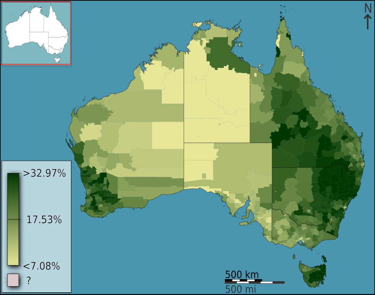
Choropleth Maps
- Definition: Regions shaded according to data values
- Common Use: Election maps, demographics, economics
- Pitfall: Large areas dominate visually regardless of population
- Example: US presidential election maps by state
Choropleth maps shade geographic regions, such as countries, states, or counties, according to a statistical variable. Darker colors typically represent higher values. They are the most common type of thematic map, used everywhere from election night coverage to public health dashboards.
The biggest pitfall of choropleth maps is the area-population mismatch. On a US election map, Montana (380,000 km², ~1 million people) receives the same visual weight as New Jersey (22,000 km², ~9 million people). This makes sparsely populated areas dominate the map visually, potentially creating a misleading impression of the data distribution.
Dot Density and Proportional Symbol Maps
- Dot Density: Each dot represents a fixed number of occurrences
- Proportional Symbol: Symbol size varies with data value
- Advantage: Shows distribution within regions
- Example: Population distribution within a country
Dot density maps place one dot for each fixed quantity (for example, one dot per 100 people) at random or approximate locations within geographic regions. This reveals the spatial distribution of data within regions, overcoming the choropleth problem of implying uniform distribution across entire areas.
Proportional symbol maps place symbols, typically circles, at geographic points with their size proportional to the data value. A population map might place circles at city centers with area proportional to population. This approach directly represents quantity through visual size, making comparison intuitive.
Heat Maps and Isarithmic Maps
- Heat Maps: Continuous color gradient showing intensity
- Isoline Maps: Contour lines connecting equal values
- Interpolation: Estimates values between data points
- Example: Weather maps, crime density, pollution
Heat maps display data as a continuous color gradient across a geographic area, with hot colors (red, orange) typically indicating high values and cool colors (blue, green) indicating low values. They are commonly used for showing density of events like crime incidents, social media activity, or species observations.
Isarithmic maps, also called contour maps, connect points of equal value with lines (isolines). Weather maps use isotherms (lines of equal temperature) and isobars (lines of equal pressure). Topographic maps use contour lines to show elevation. These maps are excellent for showing gradual spatial variation in continuous phenomena.
Flow Maps and Cartograms
- Flow Maps: Arrows showing movement and volume
- Cartograms: Regions resized proportional to data
- Minard's Map: Famous 1869 map of Napoleon's march
- Advantage: Directly encode quantity in the geometry
Flow maps use arrows of varying width to show movement between locations. Charles Joseph Minard's 1869 map of Napoleon's march on Moscow is widely considered one of the greatest data visualizations ever created, showing the army's shrinking size, temperature, and geography simultaneously.
Cartograms distort the size of geographic regions proportional to a data variable rather than physical area. A population cartogram of the world enlarges India and China while shrinking Russia and Canada, providing a more intuitively accurate sense of global population distribution than any standard projection.
Best Practices and Pitfalls
- Projection: Use equal-area for data maps
- Classification: Scheme affects interpretation dramatically
- Color: Colorblind-safe palettes are essential
- Normalization: Raw counts vs rates tell different stories
The most common mistake in thematic mapping is using a conformal projection like Web Mercator for data display. Because the Mercator inflates high-latitude areas, a choropleth map on Mercator gives excessive visual weight to northern countries. Equal-area projections should always be used for thematic maps.
Color choice and classification scheme are critical decisions that dramatically affect interpretation. A map with five equal-interval classes tells a different story than one with five quantile classes, even with identical data. Colorblind-safe palettes (like ColorBrewer schemes) ensure accessibility for the roughly 8% of males with color vision deficiency.
Key Facts
- Choropleth maps shade regions by data values and are the most common thematic map type.
- The area-population mismatch is the biggest pitfall: large empty areas dominate visually.
- Heat maps show data intensity as a continuous color gradient across geographic space.
- Cartograms resize regions proportional to data, eliminating area distortion.
- Equal-area projections should always be used for thematic data maps, not Mercator.
Fun Facts
- Minard's 1869 map of Napoleon's march is called "the best statistical graphic ever drawn" by Edward Tufte.
- The first known thematic map was Edmund Halley's 1686 trade wind chart.
- About 8% of males have some form of color vision deficiency, making colorblind-safe maps essential.
- John Snow's 1854 cholera map of London is considered the birth of epidemiological mapping.
Final Thoughts
Thematic maps are the workhorses of data visualization in geography, journalism, public health, and business. Understanding the different types and their strengths and weaknesses empowers both mapmakers and map readers to communicate and interpret geographic data more effectively and honestly.
Test Your Knowledge!
Think you know your map projections? Try our interactive quiz!
Play Geography Games →